Designing beautiful apps
A few tips for making your app look and feel great
October 10, 2025
This article is adapted from a guide I wrote for CS147L, Cross-Platform Mobile Development, a Stanford class that covers building apps in Expo and React Native.
When we're building apps as engineers, we often don't pay too much attention to design. But just a little bit of thought can turn a very basic UI into a much more polished and user-friendly experience (one where you don't have to say "I'm an engineer, not a designer"). This guide is designed so that you don't have to design your app in a tool like Figma or Sketch beforehand, but rather as a list of principles that you should keep in mind when building your app as you would before.
Color
- Choose a single primary color. Maybe two if you’re really pushing it. Coolors is an awesome place to find one. (you actually may not need this one if you like a monochromatic look)
- Choose a background color. This should not be pure white, but rather something like #fafafa or similar. Use coolors too, under the white tag.
- Choose a text color. This should probably not also be pure black, but can be. Black on white contrast is really jarring to our eyes and softening the colors can help.
- (optional) Choose two colors for surfaces. One should be raised and another muted (see below). I like pure white for my raised surfaces and a light grey for muted.
- (also optional) Choose a muted text color. This can be a medium gray and will be used for text that’s less important (you’ll use this more often than you expect)
- Use color sparingly throughout your app and only in places that are useful (primary buttons, progress bars, etc).
- You can and should also use semantic colors like red for destructive states and green for success states.
Use color sparingly for intent.
Typography
- Pick a very simple and clean font for body text. I like Inter, SF Pro, Manrope, Geist, Roboto and DM Sans.
- You can now pick a heading font - either a display or serif font or just a variant of your body font (medium and semibold look really nice)
- Sites like Google Fonts (you can install here) can be really useful for easy to install fonts.
- Define a consistent type scale with a small, medium, large, xl, and 2xl size. They should increase by 4 or 8 units each time.
- The minimum size you should include on your screen is 16px.
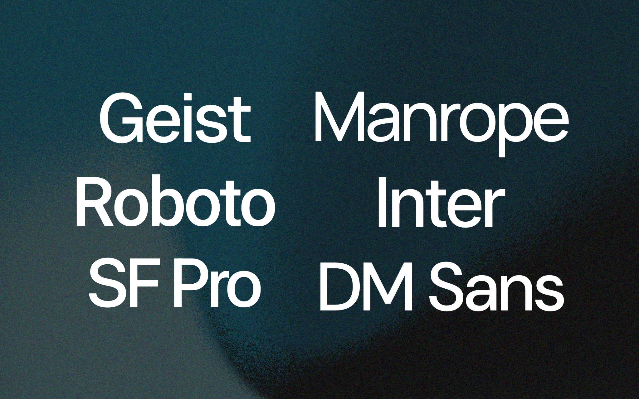
Some of my favourite fonts for UI work.
App Icon
- The app icon is the first thing somebody sees of your app - first impressions matter!
- Less is more for app icons
- Make your logo clean and test it out at small scale (you’d be surprised how small an app icon looks compared to in Figma or a design software).
- In a pinch, an icon from an icon pack can make a great initial logo, or you could step it up a notch and design your own in Sketch or Figma!
- Subtle gradients and patterns can level up your designs a notch, as can highlights, shadows, or very subtle 3D effects
- Making a splash screen helps your app feel nice when immediately opening! It takes just a few minutes but also levels up your app a lot.
- Expo makes it easy to add your own app icons

Start with a basic icon and color

Add a gradient background

Add gradients and shadow
An example of a good app icon.
Layout
- Focus on creating a strong visual hierarchy in your app. It should be immediately obvious what order to look at things in.
- Use consistent padding and spacing throughout your app. A similar scale to a type scale is a good idea.
- You are tight on space on a phone. While slight corner radii and padding is almost always essential, don’t overdo it.
- Pay attention to safe areas - you don’t want your content being covered by the keyboard or the notch on an iPhone
- Use gestures and familiar elements like tab bars to make your app feel easy to use.
Even though there's no content, you can still see a hierarchy.
Icons
- Use a consistent icon library like HugeIcons, Lucide, Heroicons, or Expo Icons across your entire app.
- Try to avoid pairing icons with text if their meaning is clear.
Motion
- Animations level up your app to something that feels great to use.
- They can easily be done using React Native (like this!). You can edit various parameters like scale, color, shadow, opacity, and basically any other CSS property.
- The easiest thing to do is to add a slight scale down or color change on button press. It will instantly feel more snappy and nice.
- You can also animate things as they go into or out of the UI - say you’re swiping on a card or sending a chat message.
- Keep animations fast (under 200ms)
- If you’re really curious, look up easing curves to dive deep into how your animations feel
Which button feels better?
Other Tips
- When you have nested items with corner radii, try to make the inside ones a smaller radius than the outside one, so they appear concentric.
- Use high resolution images. The quality of the assets you use signals the quality of your app. Good free sources include Unsplash.
- Always use padding of some sort around your UI elements. Very few things should touch the edges.
Adapted from Apple’s Human Interface Guidelines, Vercel’s Web Interface Guidelines, Emil Kowalski’s Great Animations, this youtube channel, this other youtube channel, and many many random Medium articles.